Case study · Consumer mobile app
Blink: an app that turns your best game moments into clips
Blink records mobile gameplay, finds the highlights and lets players share them and compete in challenges. As Art Director I designed the iOS and Android interface, the brand's icons and motion, the onboarding, and the marketing materials.
A new idea that people had to understand quickly
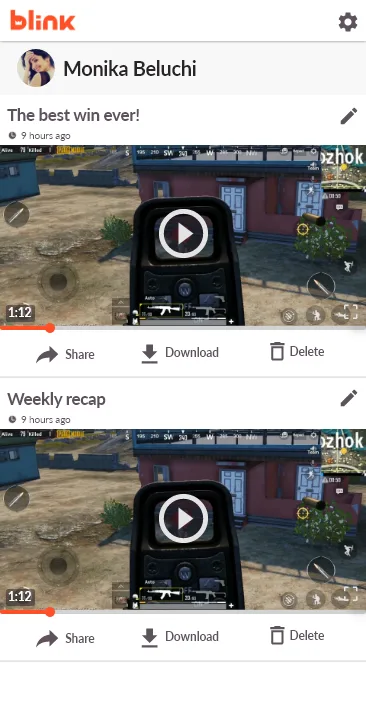
Blink works in the background while you play another app. That's hard to explain: users have to grant permissions, trust the record button, and know where their clips end up. Many would drop off before they ever saw a highlight. The design had to make an invisible product feel clear and rewarding, and stay consistent with a bold brand.
What I designed
Onboarding that shows instead of tells
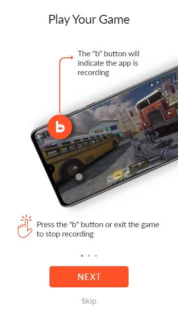
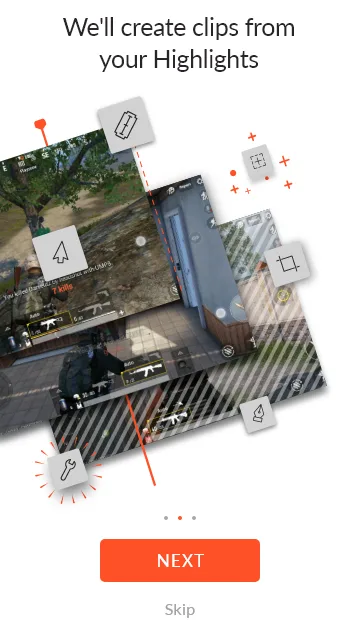
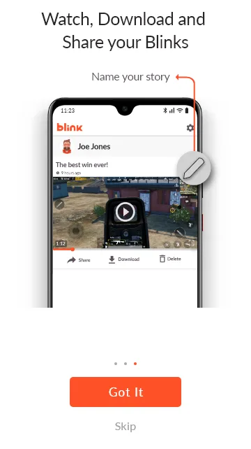
Three short screens explain the whole product: play your game, Blink cuts the highlights, then watch, download and share. Each screen uses a real-looking device and one callout, not paragraphs.
Permissions, one at a time, with a reason
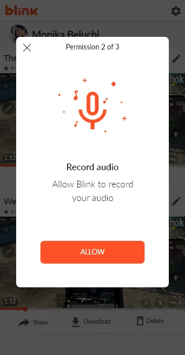
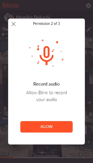
Instead of three system pop-ups in a row, each permission gets its own card with an illustration, a plain sentence and a progress hint ("2 of 3"). It's the moment users decide whether to trust the app.
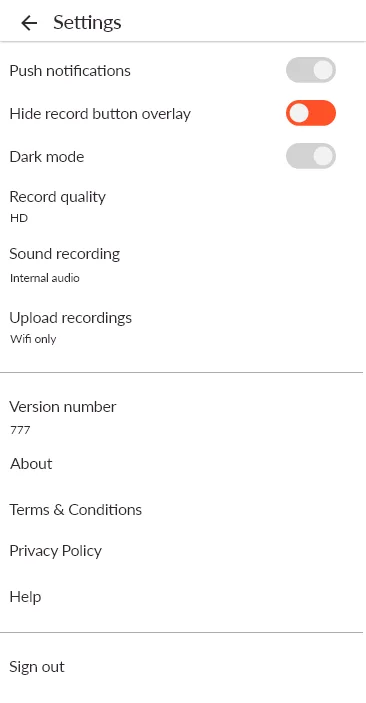
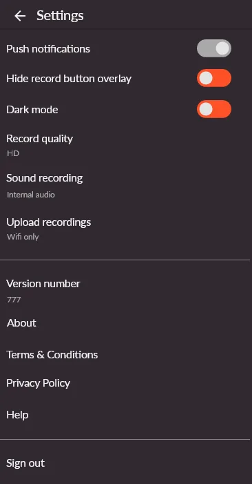
Both light and dark themes were designed, because people play in dark rooms.
Challenges that bring players back
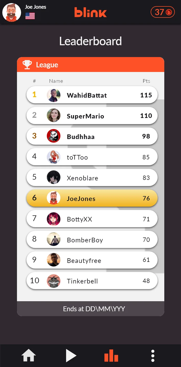
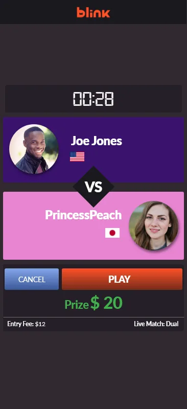
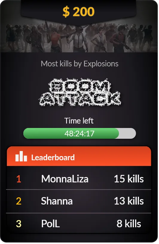
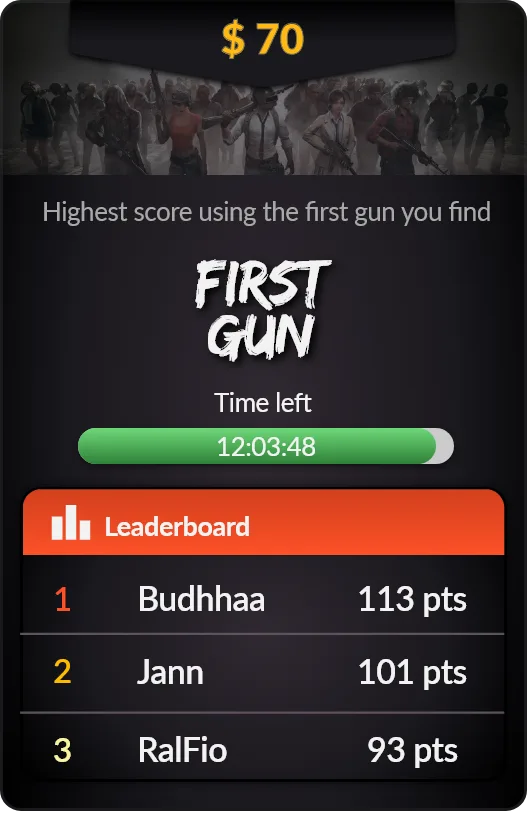
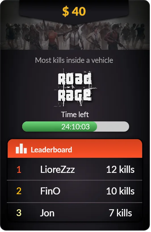
Weekly challenges with a prize, a countdown and a live top three. Each challenge has its own title treatment, but the card structure stays the same, so new challenges were quick to produce.
Motion that carries the brand
I animated the "b" logo for loading and recording states. The logo drips like liquid while content buffers, and the crown "keep" button animates to confirm a saved clip. Small moments like these make waiting feel like part of the brand.
The result
A consistent iOS and Android experience aligned with the brand guidelines, plus a library of icons, animations and in-app tutorial content that explained the product's features. I also produced posters, flyers and video to support brand awareness and user acquisition.
What I learned: when a product works in the background, onboarding and feedback are the product. Clear first steps mattered more than any single screen.