Case study · B2B platform
Probuild: making a huge construction system feel simple
Probuild runs high-rise building projects from planning to the day buyers get their keys. I designed 6 of its major modules end to end and replaced the legacy screens with one consistent design language across desktop, tablet and mobile.
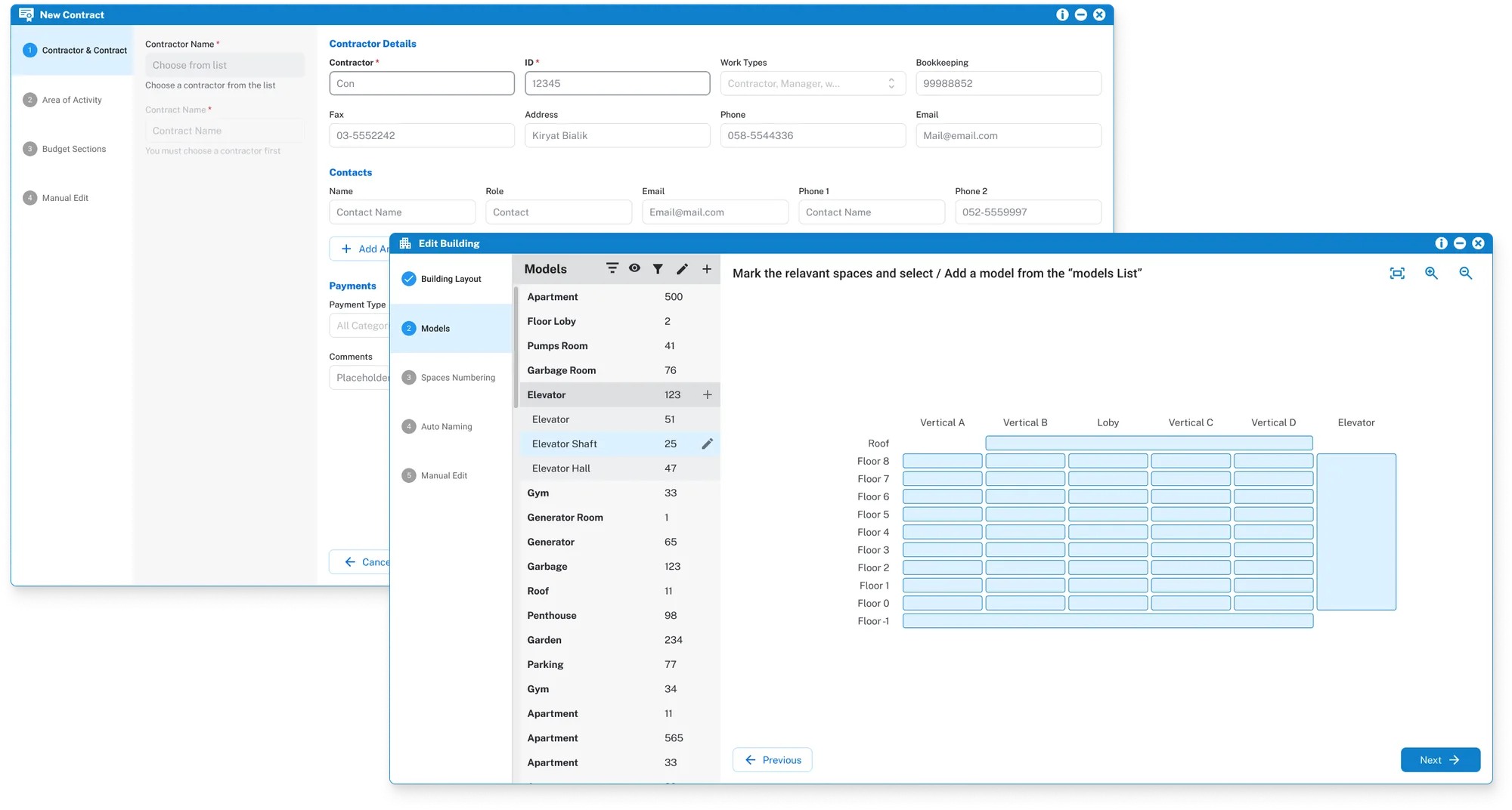
One system, many very different users
A high-rise project involves many people who all work in the same system: site managers on tablets in the field, purchasing teams placing orders, sales teams tracking apartments and buyers, and managers following budgets and progress. Each module had grown on its own. The result was dense legacy screens, inconsistent patterns and long forms that only experienced users could get through.
My job was to redesign the modules people use every day, so that a new employee could finish a multi-stage task without training and a power user wouldn't slow down.
What made it hard
Legacy system
A working product with real data and habits. Changes had to fit what developers could ship step by step.
Hebrew RTL and LTR
Every table, form and icon had to work in both directions, including numbers and currency inside RTL text.
Three device sizes
Office staff on desktop, site teams on tablets and phones. Same data, very different contexts.
Many user types
Site managers, purchasing, sales and management each need a different slice of the same project.
Very dense data
Budgets, quantities and stages across hundreds of spaces per building.
Full lifecycle
Planning, sales, purchasing, on-site workforce, progress tracking and apartment handover.
How I approached it
Wizards instead of one long form
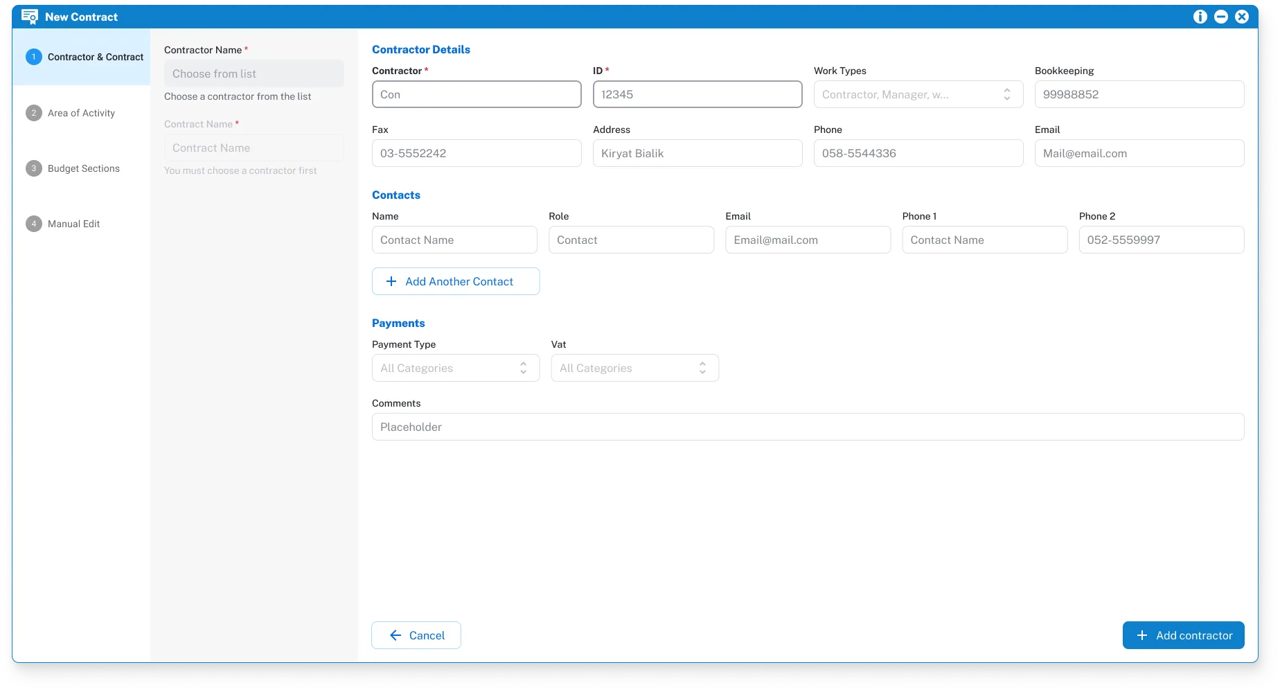
Setting up a building or signing a contractor used to mean one huge form. I split these tasks into clear numbered steps, each asking only for what it needs.
Fields that depend on earlier choices stay locked with a hint ("You must choose a contractor first"), so people can't get lost or submit half a contract.
Show the building, not a table of rooms
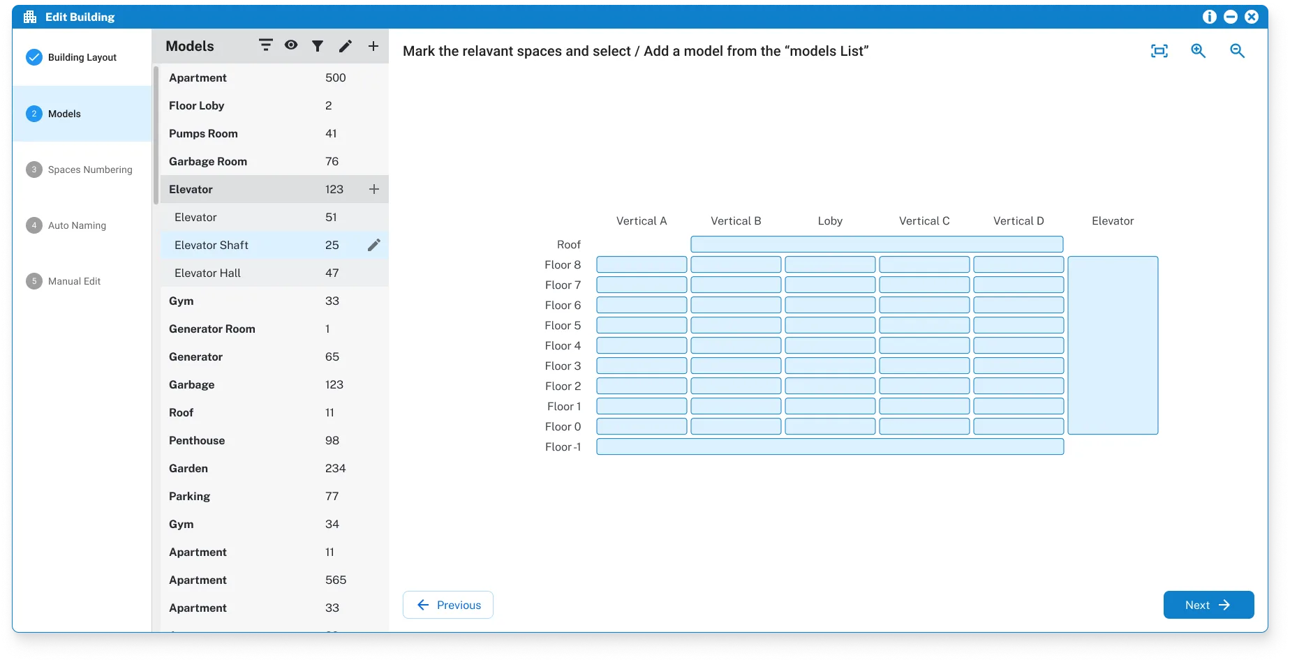
A building has hundreds of spaces: apartments, lobbies, elevator shafts, pump rooms. Picking them from a list was slow and error-prone.
I designed a floor-by-floor grid that looks like a section of the building. Users click spaces directly and assign a model or a responsible person, with the model list beside it for counts.
One pattern, reused across modules
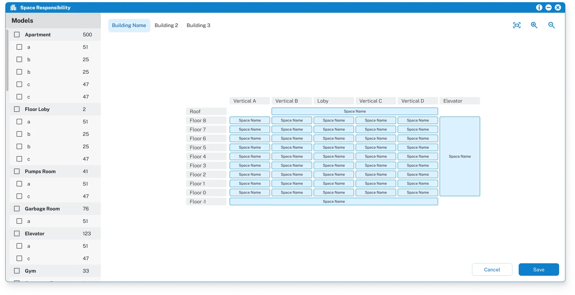
Once the building grid worked, I reused it for space responsibility: the same layout with checkboxes in the model list and tabs for each building in the project.
Users who learn it once can use it everywhere, and developers build it once.
Dense data that still reads clearly in Hebrew
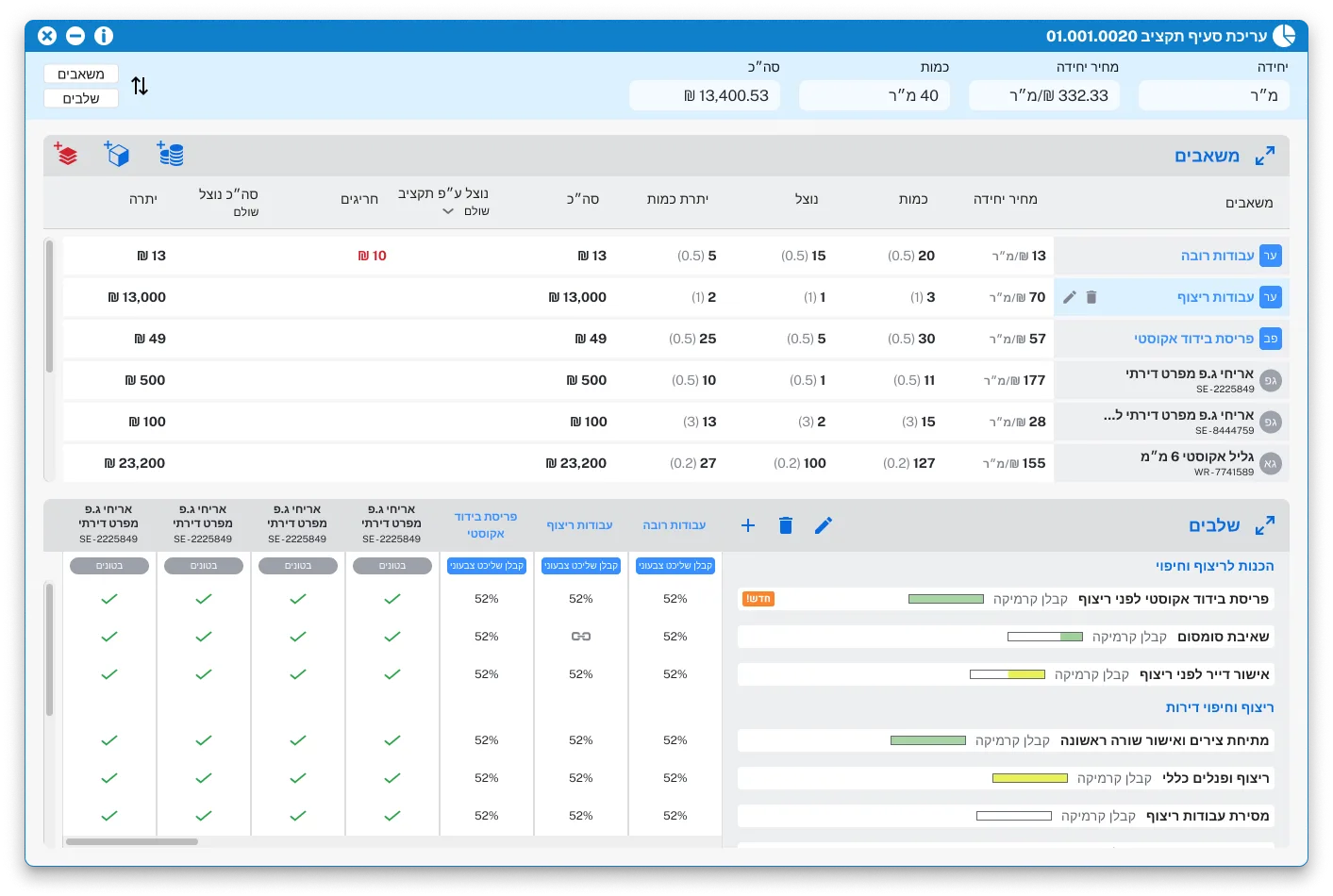
Budget items combine resources, quantities, money and stages. I kept everything on one screen but split it into two areas you can expand: resources on top, stages below. Progress bars show how far along each stage is.
The whole layout mirrors for RTL, while numbers, units and currency keep their natural direction.
Designed for the site, not only the office
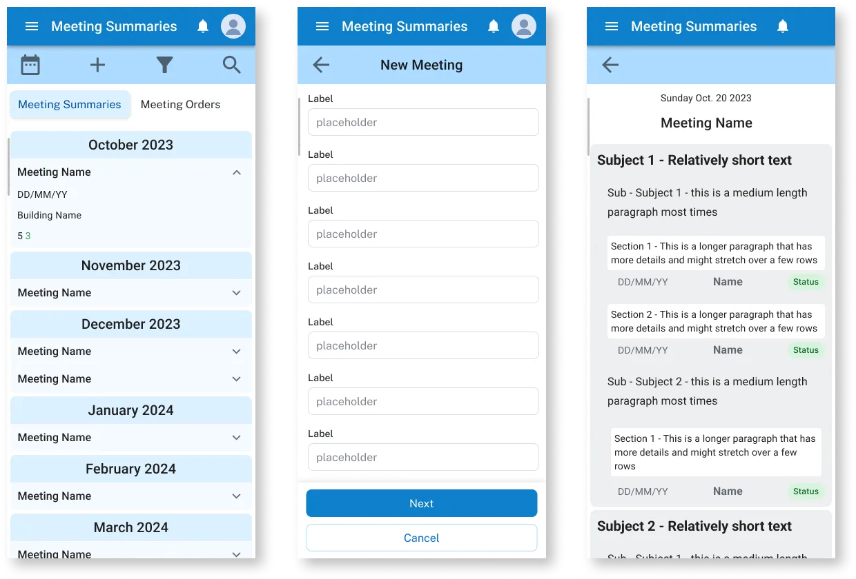
Site managers record meeting summaries and tasks on the go. I designed the module for phone first: a list grouped by month, a short form, and a readable summary with a status for each task.
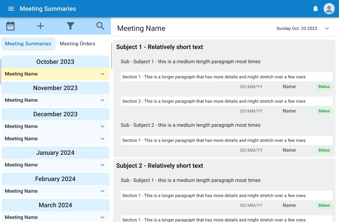
On tablet the same content becomes a list-detail view, so nothing has to be relearned.
A component library to keep 6 modules consistent
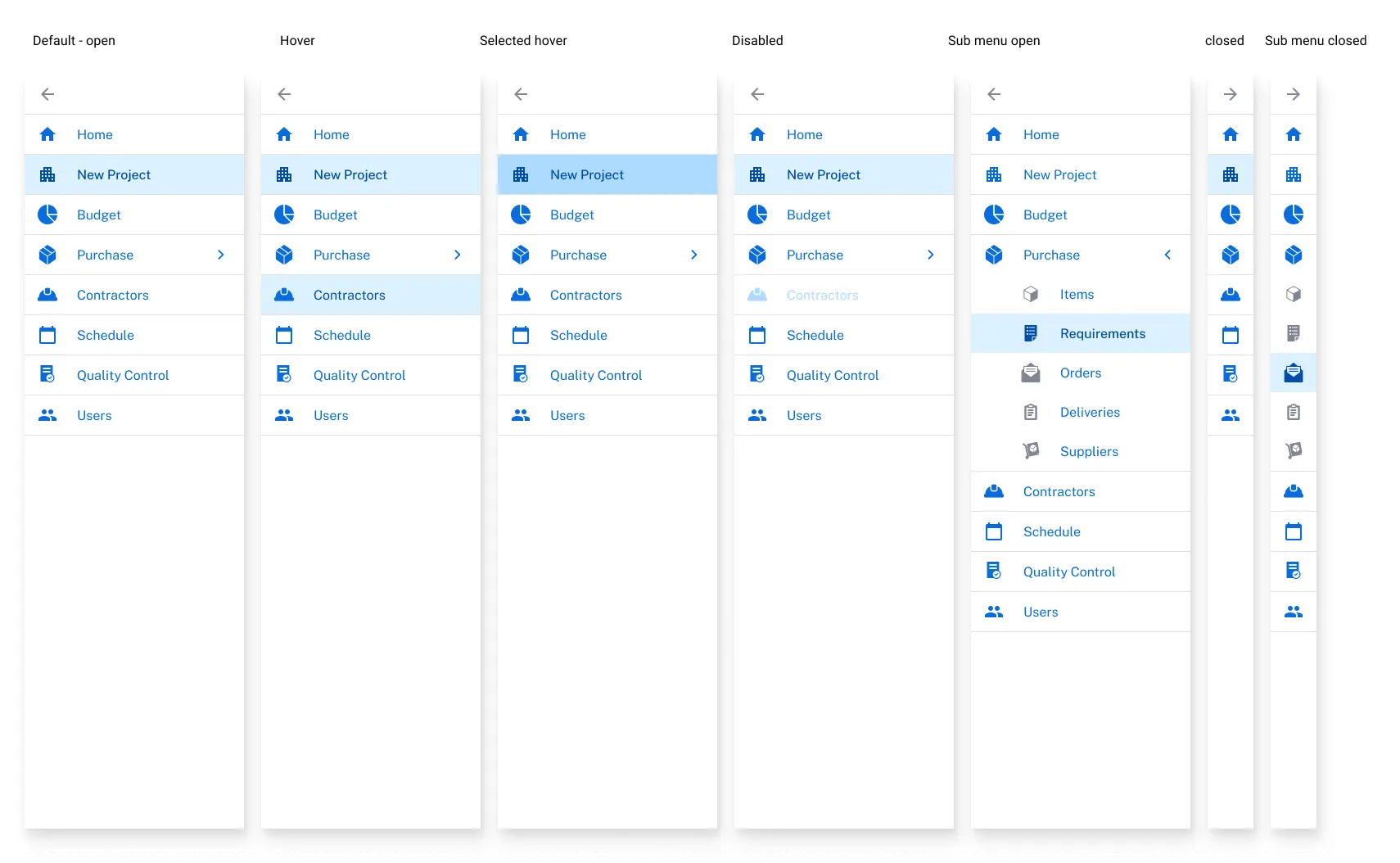
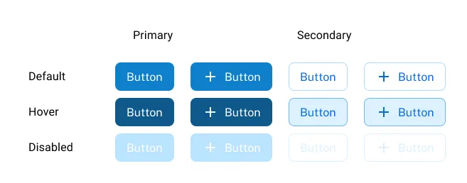
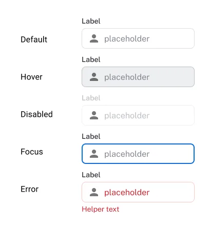
To stop each module from drifting again, I built a reusable component library in Figma: navigation, buttons, inputs, search, icon buttons and pop-up windows, each with all its states. It became the shared language between design and development across desktop, tablet and mobile.
The result
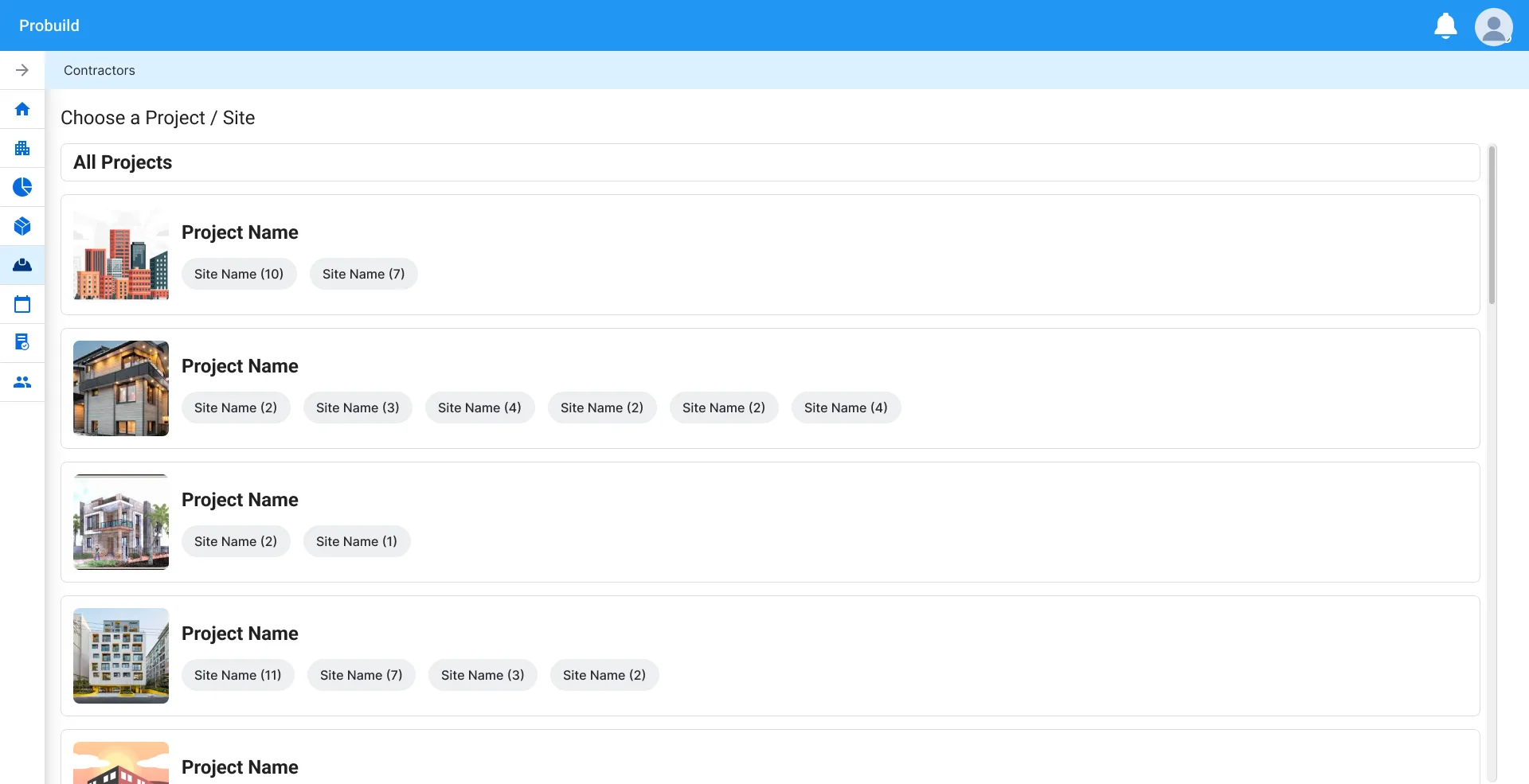
The legacy screens were replaced with a modern, consistent design language. Multi-stage tasks like contracts and building setup became guided wizards, and I worked closely with the developers from the first idea to implementation.
What I learned: in a complex system, consistency does more for users than any single screen. Reusing one good pattern, like the building grid, helped users and developers more than designing every module from scratch.